Thursday, 11 December 2014

Beyond the Stars! - My Unity Game Project

The final post of 2014 shall by my Unity project for this term - a sci-fi adventure game called 'Beyond the Stars!'

The game revolves around a young Betelgeusian called Stahila. She comes to Earth to look for her brother, who disappeared 10 years prior. However, she too crash lands and is stranded in the strange, hostile, and rockin' n' rollin' 1950s Nevada.


The "One Sheet" for my project.


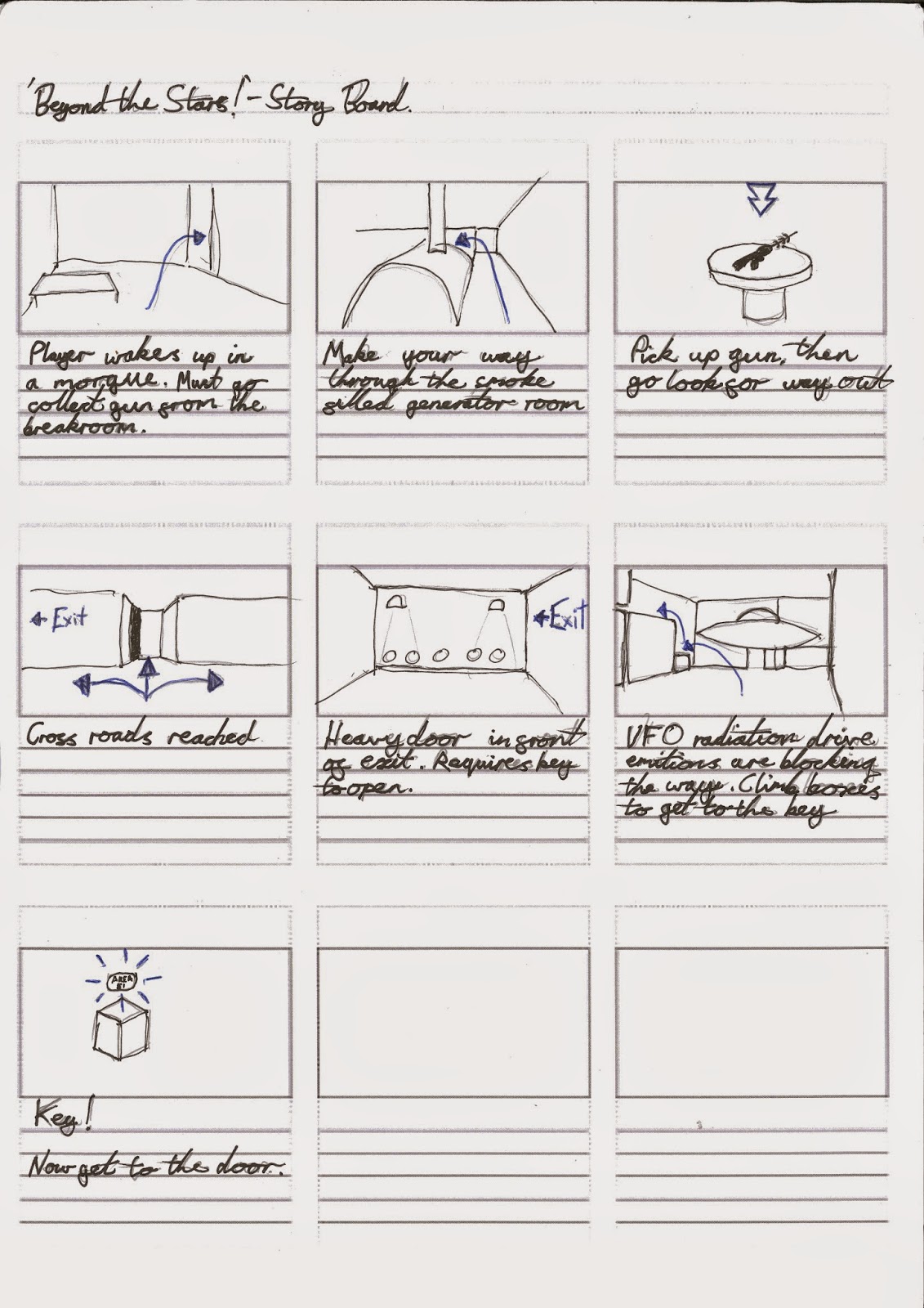
The initial level involves the player attempting to escape from Area 51 in order to resume their search for their brother. I initially planned the level to involve multiple keys, doors, and enemies to avoid. However, I have come to the realisation that coding is really, VERY difficult, and I had to scale my ideas back down to something more reasonable (a ray gun to pick up, and a key to open the exit door). I kept the map rather large though, in order to get the player to explore and seek out the objects required.

Story Board of the level's progression.

I created several props for 'Beyond the Stars' in Maya in order to test my skills.

Wooden crate.

A 50s style chair.


The Heavy Exit Door.


The Key Card that opens the door.


The Ray Gun, with bonus chairs!

I neglected to texture the last three assets in Maya so I did so in Unity. Yes, they look rather simple but unfortunately I left the assets that needed coding to the last minute due to my loathing of scripting.


This has been a fun project though. I always knew that my first ever game wouldn't be great but this at least functions and should provide at least 2 minutes of gameplay.

Saturday, 6 December 2014

Temple Assessment

This is an assessment to test our 3D modelling and texturing skills. We were given a week to recreate this temple:


 And here is mine, in it's various stages of construction:


These few images show the progression of the build over the past 9 hours or so of work. I haven't worried too much about scaling of the doors and such, as I can sort that out later when I go over the finer details. I was mostly concerned with the texturing as I find this challenging, but after an hour I got it to a level I feel is acceptable.

But now for the finished product! Around 12 hours of work, with better colours and proportions, and a majority of the fine details.


The porch area I found particularly difficult, with the indented and extruded prisms. I found the easiest method to be to angle a cube at 45 degrees, sub divide across the x and z axes and then extrude the right faces.

Thursday, 4 December 2014

Life Drawing

It's high time I uploaded my progress in this area. Unfortunately some of the pieces were folded and not rolled up, so there's some creasing and smudging.


This session was all about experimenting with our arms and wrists. We did pieces with short wrist strokes, then elbow, and then just using the shoulder. This proved to be A) the workout routine I so desperately need, and B) really good fun, and I found myself leaning towards the shoulder strokes, as it complimented my style of drawing well.

The last image in this set is done using our opposite hands; done with my right hand as opposed to my left. Despite the child-like writing and how weird the experience felt, I eventually became comfortable with it. I could get the shading and forms right, but was unable to get accurate proportions.

---------------------------------------------


This set I chose to focus on the head and neck and their respective shading. It had been a while since I had done portraits properly, and the eyes are out of proportion on both pieces. However they both have their merits, as I prefer the shading on the first and the overall form of the second, which matches our models more closely. Shading the tendons and neck muscles has also worked out well, and the proportions are a good match.

---------------------------------------------


Shading of more general areas of the body. The torso I am particularly happy with.

---------------------------------------------


Halloween week! This session we used the grid method, which I found particularly challenging. It was strange to work from both an orthographic grip and then to draw our model as a part of that element of the image, rather than the two being separate.

We also drew our model in various zombie-like poses, because Halloween. Biro was used and I think this fit the task well - there's something about Biro that always seems panicked, rushed, and creepy.

---------------------------------------------


This final set is using a mix of charcoal and chalk. This is something I've been looking forward to as I think these two materials compliment each other perfectly, and it makes it so much easier to define highlighting and darker areas. I also found some compressed charcoal useful to further darken some lines and areas of shadow in the first piece.

The last two are part of a personal experiment - the differences between a flowing, curved line approach and a more blocky, perhaps cubist style. I prefer the curvy use of lines personally, as it feels a lot more human.

Saturday, 29 November 2014

Anatomy and Proportion

This week in our 2D work we were taught how we can distort basic rules of proportion to create humanoid creatures. Naturally for games design, this meant creating Elves and Dwarves.


My Elf didn't really work out as I wanted it. I got the height right (9 heads tall as opposed to the standard 7-8), but it doesn't have the usual slender profile that is indicative of Elves.


My Dwarf, however, I am very happy with. I got the short, stocky look I wanted, though he might have looked better with an axe than a sword.

This was merely the task for the lesson though, and the task for outside of class was to practice our anatomical drawing. I've never done much of this, which is probably poor form for a previous Fine Art student. I've had my fair share of drawing skulls though, so I tried to focus on the bone structures of the torso and the limbs.


And finally, a front, back, and side view of the whole skeleton. I've tried to capture the shading of some of the more difficult areas in the back view.


Thursday, 27 November 2014

Animating the Fish

The fish that we made for a first Maya assignment has had an upgrade! And now it was time to learn animation.


The task starts with constructing the skeleton. Here is the main body of the rig.


Then comes the bones for the pectoral fins. This whole part of the task was relatively simple but good fun.


Here is the finished skeleton. This is the stage where we learnt about the "Paint Skin Weight" tool - using a brush to adjust which areas are effected by a joints movement.


Here is the tool in action. 


Once that task was complete, it was time to start animating. I set the animations of the body to occur at the beginning, middle, and end of the scene, to get a smooth speed and look. The pectoral fin animations occur once every 10 frames.